Saturday, 5 April 2014

SELF BRANDING//RESEARCH AND INSPIRATION//OUGD602

self branding research:
These branding examples caught my eye, if not particularly for the overall design, for the simplicity and general idea.  Last year for one project I wanted to make a stamp, which is something Im eager to do this year with self branding.  I don't especially like the stock used below but I think the logo design is nice and simple and something I would want when printing on brown stock.
This isn't an example of self branding but I just really like the clean and stylish look of the publication and this kind of style is the kind of thing I would like my self branding to display.  Something like this could be used as the cover for my manifesto etc.  I like the contrast in stock and I think the typeface works really well.
Another simple clean design, I like the layout for a letter head, and the logo is simple.  With letter heads and business cards I have been thinking about stock choice rather than layout.  I think with self branding, especially if your design is quote simple, or just a typeface for example, I think the displaying of it and the stock choice can make all the difference.  A combination of stocks is something I will look to use when designing my self branding.

SELF BRANDING//DESIGN DEVELOPMENT//INITIAL IDEAS//OUGD602

self branding: initial ideas
I started jotting down some ideas for the kind of style and design I wanted with my self branding.  I found this quite difficult because trying to sum yourself up with a logo and a branded range to try and portray you as a designer and individual is a hard task.  As I wasn't happy with my branding from last year I wanted to step away from that general feeling.

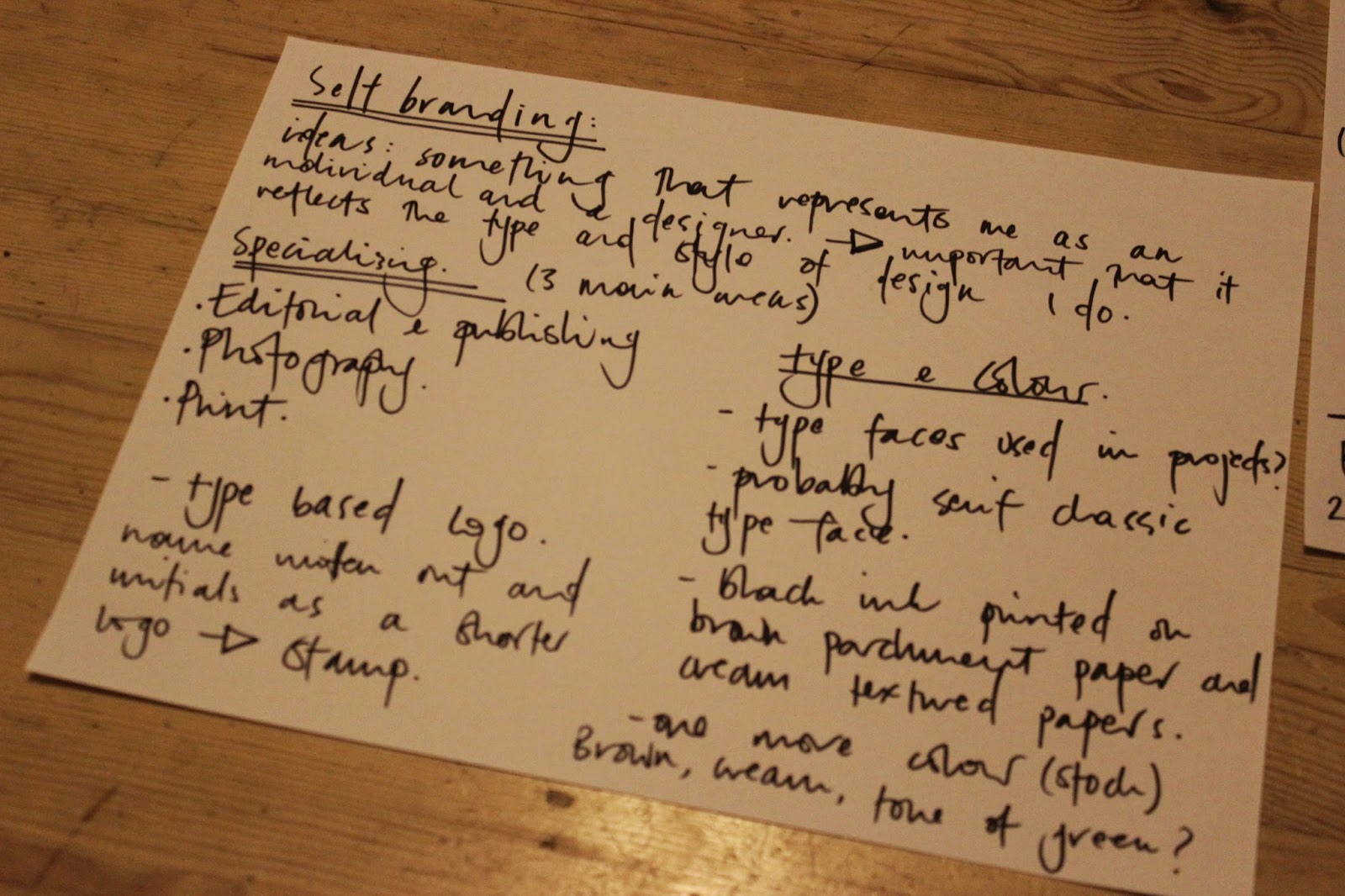
I have looked at various self branding examples and the ones that seem to catch my eye are simple, mostly type based and attention to detail in terms of what stock its printed on etc.  Thats something I will consider when designing, I want to use a variation of stock colours, initially I thought about textured cream stock, brown parchment and one other colour.
I wanted something that represented me as a designer and originally I thought about have a drawing or some hand written type - however, I don't think that would of reflected me particularly well as illustration isn't something I really include in my work.  I would quite like to use my full name in the branding, including my middle name because I think it looks quite good printed.
I started by looking at some work and seeing what type of style I was displaying and how this could be shown though branding.  I decided to start with a typeface, one that I had used in one or two projects that I really liked, Minion Pro, (kerned, regular or italicised) but I also wanted a smaller symbol that could be applied to smaller formats and also be used as a stamp.
For the smaller symbol initial ideas included just my initials either in a circle or square, something simple that could be stamped onto various stocks etc.  Black ink would probably work best if I want to print on brown parchment stock.  Think about one more stock colour to incorporate and where the word 'graphic design' or 'graphic designer' would fit in with the logo etc.

Friday, 4 April 2014

FINAL EVALUATION//BRIEF 12: SECRET 7"//OUGD602


secret 7" collaboration final evaluation
I enjoyed collaborating on this brief, this was another outcome that I was happy with in the end, and learnt a lot from the printing experience. After collaborating on Spectrum Emily and I decided to collaborate on this as we work well together but didn't get the outcomes we particularly wanted from the brief.  I felt this was a brief where the outcome was successful in terms of taking the brief into consideration, not only with how it turned out visually but also with the concept behind it.  Emily worked on the visuals and I researched on how we could build a concept around it.  The feel and atmosphere of the song and music is what influenced the visual behind it, the lyrics are what influenced the concept, the song being called karmacoma, I looked into karma symbolism in various cultures.  This symbol (the endless knot) was embedded into the colourful and trippy pattern for a subtle result.  After doing this we extended it further as I looked at how type could be incorporated into the design.  I feel this brief taught me how to work to a tight deadline as the original design was done in one session.  The biggest learning curve, that seems to be a reappearing theme this year is printing.  When Emily and I first printed we were really unhappy with the colours, the design on screen involved a lot of vibrant colours which were dull and murky when printed on the stock we got from Leeds uni.

After asking James we learnt that his paper would had chemicals in that would allow the colours to be printed to a much higher quality.  Once the nets were printed and assembled we were happy with the final outcome.


Again, something that I've mentioned that is beneficial to the overall outcome of the work is the photography.  Again I used professional equipment in the photography studio which is something I'd never done before third year.  We then went onto make another version of the sleeve that worked as a pair, contrasting in colours.  Overall I am happy with the final result and I think the collaboration allowed us to create something we were both keen to try in terms off aesthetics.

Thursday, 3 April 2014

FINAL EVALUATION//BRIEF 09: MEANTIME//OUGD602


brief 09: meantime //  final evaluation
This was a brief that originally I hadn't written up or intended to do but sort of developed and turned into one of my longer briefs.  I feel this was quite a significant brief in third year and changed the approach and feelings I had towards my final outcomes in third year.  I feel the outcomes from this brief were one of the first deliverables that I was actually happy with and I had to overcome some printing issues to get the exact outcomes I wanted in the end and because of this the brief spanned from before Christmas until afterwards.  I felt like I had quite a lot of freedom with this brief and the way I wanted to design it which always makes the brief more engaging and interesting.  I was working with photographs I had taken and looking at visuals that could represent the lyrics and the feel/atmosphere of the song.

I also enjoyed extending the brief, when designing the four sleeves it kind of turned into making a logo for the band which I then put onto tee shirts (screen printed) and made stickers of.  I feel doing this brief allowed me to improve my screen printing skills dramatically.  Compared to the outcome of my screen printed tee shirts in second year the ink has transferred a lot better and looks a lot cleaner and more professional.

second year screen printing
This was from a project in second year, you can see the ink hasn't transferred as well as it should of done and also looks faded but it had only just been done.  I also learnt that you need to press heat the final print in order for it to not fade when washing the tee shirts, something I didn't do in second year.
third year screen printing

printing:
When I was trying to print the final designs for the december hand in I didn't really investigate into what stock would be best for folding the nets and for allowing the colour on the images to be as vibrant as they possibly could, so I was disappointed.  I went away and edited the size of the record sleeves and the nets as the prints had come out pixilated and looked into what stock would benefit the overall design.

first time print
photos do not print well onto the text, the scanned in stock that I used as the background for the logo is pixilated and the general quality of the photographs in these prints are dull.
second time print / edited nets
I was a lot happier with these prints - the stock from the print room allowed the images to show up a lot clearer and editing the nets prevented the images from being pixilated - I also changed the logo so it could go across a range (tee shirts) 
photography:
Another area of this brief that I think has really helped me was photographing the work.  Shockingly this was one of the first times I'd used any professional photography equipment from the photography department.  This made all the difference and I was quite pleased overall with the way the final images had turned out.
This was the turning point in my practice where I was starting to care a lot more about the final outcomes of my designs and the kind of style and direction I wanted to take for my portfolio and how it could best represent me as an individual and a designer.

Tuesday, 1 April 2014

EASTER BREAK//IDEAS AND EVALUATION//OUGD602


easter break: progress// evaluation

new ideas
the drinks club:
My original idea for the drinks club logo was to use signage from above the door of the venue, however after drawing it out and scanning in trying to digitise it and edit the anchor points I found I didn't have the technical ability to design the script logo to the quality I wanted and so now have to rethink the approach to this brief.  

Part of an early theme within the drinks club was the idea of this kind of humorous 'philosophy' of drinking idea that was put forward for a branding idea.  I feel this could be developed into quite a good concept for a light hearted branding idea.
-dictionary definitions and quotes about philosophy relating to alcohol in some way, the art and philosophy of drinking.

-classic serif typeface, traditional label

black and white photographs/portraits of famous philosophers - printed, scanned and manipulated to distort the image - 'drunk' effect

-famous philosophers signatures as part of the drinks club logo

-book passages, old book pages working as bottle labels?

museum of childhood:
-poster ideas for the museum: old black and white photographs (preferably from sixties to seventies era) of generic childhood photographs, children playing etc.  cut out and placed on different textured backgrounds.  Scan ins of old packaging and childhood toy drawings (collected from primary research) over layered on the cut out black and white images (posters A3 - three posters - plus museum of childhood logo) 

publication idea - book of collected childhood memories written in peoples handwriting? more personal? 
type based design - not heavy focus on images.
typewriter? 

ditto brief - collecting conversations
A4 publication - collecting conversations - hand written and typed up - importance of communication - focus on printing for this brief - an archive of conversations to refer back to, printed on a variety of stocks - stock choice could be dependent on the location of the conversation - the topic of conversation etc.  could photograph the location of the conversations for the publication or map the time and date the conversation took place.

personal manifesto - collage ideas
flowers collaged underneath ripped bit of paper uncovering William Morris quote about nature and beauty
flowers montaged over old photographs?
ripped paper with type on layered on scanned flowers


competition brief
unsung heroes
self branding


evaluation:
I feel in terms of ideas and moving forward with the above briefs the past two days have definitely been productive but in terms of final outcomes and finished designs I am very still much in the process of getting that right.  Its slightly demotivating as time is an issue and I don't have enough time to experiment with various ideas for all of the briefs.  I think I need to be aware of the time restriction and work to that.

FINAL EVALUATION//BRIEF 08: SPECTRUM (COLLABORATIVE)//OUGD602

spectrum part one final evaluation
This brief was quite interesting as I found the research, process and development to turn out quite different to the final outcome, a change of direction Emily and I didn't expect.  I thought throughout the early developing stages of collecting visuals and researching techniques we were organised and had a clear direction with what we wanted to achieve with quite a clear style direction in mind.  However, the brief was left as the intensity of COP heightened and we felt we lost our memento with it a bit.  We did manage to finish the brief before the December hand in which was encouraging, but the final outcome didn't involve the original ideas we had in mind.

The process ended up being a digital one rather than a manual, hands on approach that we'd looked into previously.  Although we weren't entirely happy with the end results I felt the brief allowed us to research into techniques that I didn't know much about before and that hopefully we can use on the second part of the brief.  We have decided to extend the brief and write up a spectrum part two for the next term so we can hopefully get results that we pictured originally.

In terms of the designs actually produced we found colour to be quite a difficult obstacle and eventually decided to keep the set of posters all in one colour as we thought this showed consistency throughout.  The end products resulted in four posters and four promotional postcards, one poster Emily and I were particularly happy with, however given the opportunity again I feel we would do things differently.

FINAL EVALUATION//BRIEF 10: DR ME//OUGD602


dr. me syas make a flag // final evaluation
This was an interesting brief to do as its been the shortest one I've done this year and as it was a flag brief it was interesting to print on a different material as i've never really looked at printing onto cloth/material.  I also enjoyed the collaborative aspect of the brief and the limited time scale as I feel this allowed us to generate ideas quickly, act on them and design all within a few days.  Sometimes I find that refreshing as I can work on a brief for longer than I need to and it can sometimes result in me becoming frustrated with it or wanting to move onto something new.

For this particular brief, Steph and I had similar ideas of the kind of aesthetics we wanted to go for with the brief and the style, both in agreement that we wanted to create collages/photomontages.  I thought with this brief the concept was quite strong as we firstly listed visuals that we would quote like to incorporate into the design such as maps, compasses, birds (all these themes encompass travel or journeys which we thought were appropriate for a flag design.)  We then looked at how we could give the design a concept without just designing something that was visually to our taste.  We researched into bird migration and the types of birds that migrate in certain directions and whether they head north, south etc.  The research process in this brief was quite rewarding as I feel the research stages really helped develop the final design.   Through research and thought out concept generation we then designed the final flag which displayed e map in a compass diagram with swallows.

Overall I am happy with the final flag design, although the printed version is slightly pixelated due to the scale of the flag and the image size we used.

final flag: