Friday 31 May 2013

END OF MODULE EVALUATION//OUGD502

END OF MODULE EVALUATION:

What skills have you developed through this module and how effectively do you think you have applied them? 
This module has taught me a lot about the industry, through study tasks and various lectures I have learnt about areas such as networking, sectors within the industry, costing and a better understanding of both PEST and SWOT analysis.  It has also given me a clearer direction of what type of designer I want to be and has allowed me to reflect on my work throughout the year which has lead to a clearer understanding of what career path I would like to go down.  Throughout this module I have discovered new studios and designers that I have become increasingly interested in and used as a source of inspiration, this module has also encouraged me to get in contact with some of these places and start networking.  This was something I had thought about in the past and the prospect of it seemed quite daunting but this module has made the idea of networking and getting in contact with people from the industry seem a lot more approachable and achievable.  The knowledge I have learnt throughout this module, I was then able to apply when we worked as a group for 'Life's a Pitch.'  My understanding of how to set up a business in terms of costing, individual roles and work ethics is a lot clearer.  I feel throughout this module I have also been able to improve on my presentation skills, both with the group presentation and the individual.  The end of year PPP presentation has allowed me to look back at everything I had done from the year and reflect on it in a general overview, presenting it to my peers was something I was nervous about but doing this has made me feel more confident and given me a sense of achievement.

What approaches to/methods of design production have you developed and how have they informed your design development process? 
This module has allowed me work on my own personal self branding.  This was something I hadn't given too much thought before this brief but has definitely given me a starting point which I now can progress from.  It has also given me new experiences when working in a team, putting ideas together and generating concepts in order to come up with a successful proposal for a business plan.

What strengths can you identify in your work and how have/will you capitalise on these? 
I think the main strength I can identify within this module is the ability to reflect on myself and my own work.  I think this is a vital skill that has definitely benefited my practice as I am able to recognise my mistakes and weaknesses and improve on them for next time.  It has allowed me to get a better understanding of what sort of design I am interested in and therefore what type of studios would be appropriate for me to work in.  I feel this module was the reason I got a work placement over summer, it was constantly encouraged to start networking and emailing studios which I did, this resulted in me getting a work placement in one week at Feref, a branding studio in London.  I feel through the study tasks I now have a much better understanding of the industry, the various sectors and how to apply SWOT and PEST analysis to my writing.  I have also improved on my analysis of designers and design studios works.  Another strength I can identify is team work through 'Life's a Pitch' this was a project that was structured in a way that allowed me to grasp a better understanding of what trying to set up your own business would be like.  I felt like our group worked together to create a realistic and successfully thought out concept and proposal.

What weaknesses can you identify in your work and how will you address these in the future?
Even though I wasn't disappointed with my self branding I do feel like I need to build a stronger concept and make it reflect me more as a person and as a designer.  I think it was a good starting point that I can now build on.  The main weakness I can identify within this module that has been a running theme all year is time management.  I think this module highlights this weakness more than any other as it was an ongoing module throughout the year and was quite easy to postpone with the pressure of other modules right until the end.  It was quite frustrating with the design presence brief as I feel this is something that I would of enjoyed spending a bit more time on and would of liked to explore more possibilities to create something I was fully satisfied with.  If I would of organised my time more effectively I would of liked to of pushed the boundaries with that brief further and improved upon the products designed, the range created and the methods of distribution it could of taken.  Something that I have always lacked confidence in is the ability to present my work, even though the end of year presentation has allowed me to gain more confidence for next time I feel I definitely need to improve on my presentation skills.  I underestimated the time it would take to prepare a presentation that is basically an overview of what I have done in a year.  I also feel for next time I should try and make the visual content of the presentation more engaging for the audience as I was quite unsure what to put on some of the slides.

Identify five things that you will do differently next time and what do you expect to gain from doing these? 
  • Time management - I feel this has been the biggest weakness all year along with organisation skills.  Next year with the PPP module I will treat it as an on going blog that I update weekly.  I will also keep up to date with study tasks and tasks set within the module so to not feel the pressure of trying to get them all done towards the end.
  • Networking - I feel I should of got in contact with more studios and made more of an effort with networking.  This is something I will definitely be concentrating on more next year.
  • Online presence - This felt like something I didn't work hard enough on throughout this module and will make a conscious effort over summer to set up a behance and a Linkedin.
  • Studio visits  - Even though I have arranged a studio visit and a work placement over summer I wish I would of organised a few more visits throughout the year to get a varied experience of a range of different studios.
  • Self branding - I would of liked to of focused more on my self branding, this is something I found enjoyable but the design could of been improved massively in terms of concept and what it says about me.
Attendance = 4
Punctuality = 4
Motivation = 4
Commitment = 3
Quantity of work produced = 3
Quality of work produced = 3
Contribution to the group = 4

DESIGN PRESENCE//FINAL PRINTED PROMO PACK//OUGD502

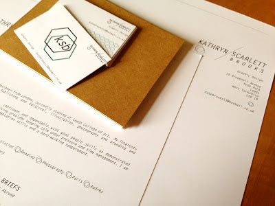
FINAL PRINTED MOCK UPS OF BUSINESS CARD, LETTERHEAD AND CREATIVE CV

BUSINESS CARDS
LETTERHEAD AND CV
CREATIVE CV
 CREATIVE CV//SAMPLES OF WORK
PROMOTIONAL PACK

STUDY TASK TEN//PRESENTATION//OUGD502

PPP PRESENTATION SLIDES
These are the slides for my end of year PPP presentation.

Tuesday 28 May 2013

DESIGN PRESENCE//FINAL MOCKED UP WEBSITE//OUGD502

PAGES FOR FINAL MOCKED UP WEBSITE

HOMEPAGE:
 HOMEPAGE SHOWING ROLLOVER IMAGE:


INDIVIDUAL PROJECTS PAGE
SINGLE IMAGE PAGE: 

ABOUT PAGE:
CONTACT PAGE: 

Monday 27 May 2013

CONTACTING STUDIOS//RECEIVING REPLIES//OUGD502

REPLIES
After emailing the studios my first reply was from Hato Press which I'm pleased about because this was one of my favourite studios in terms of what the studio environment looked like and what work they produced:


CONTACTING STUDIOS//OUGD502

CONTACTING STUDIOS
As I will be back in London for most of the summer I decided to contact some design studios I like to try and arrange some visits, this is the email I put together:

EMAIL TO STUDIOS:
Hello, my name is Kathryn Brooks, I am from London and am currently a second year BA Hons Graphic Design student studying at Leeds College of Art.

I have been looking on your website and really like the work being produced.  I wondered if it would be possible to visit your studio over the summer and have a better look at the way your company works and how the designs are created. 


Thanks very much and I look forward to hearing from you.

Best wishes
Kate


The five design studios I chose to contact were:

  • Hato Press
  • Praline
  • OWT creative
  • Inventory studio
  • View creative 


STUDY TASK EIGHT//PART TWO//CREATIVE CV//OUGD502

This is my final CV concertina fold:

DESIGN PRESENCE//WEBSITE DEVELOPMENT//OUGD502

WEBSITE DEVELOPMENT:
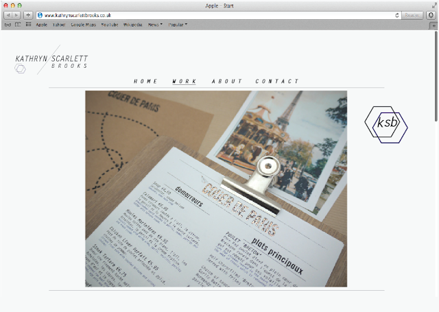
I wanted to keep my website simple and realistic in terms of what I could potentially code.  I started by applying my logo to where it could potentially be displayed on the site.  I firstly chose to have my navigation top and centrally aligned.   I chose the typeface Gotham as I thought it was bold and simple and worked well with the rest of my branding.  When on the selected page the button will be underlined: 
Standard website layout, with logo:
For the homepage I wanted a selection of photographs from my work that you could click on and it would take you to an individual page where their would be an overview of the project and more images of the work.  For the homepage I tried making the photos black and white so the style of the website would be consistent and all the same colours.  When hovering over a specific project the image would either go back to its original colour or have a faded opacity of the green colour I used throughout my branding.
However, after looking at the images collectively I decided my work didn't benefit from being in black and white and felt that the images looked more appealing and worked better when they were its original colour.
For my homepage I wanted the images to make up one big image without all the samples of work being the same size, these are the images of work for my homepage.  i have also placed my logo on the page for consistent branding:
Individual page of website:
When clicking on an image of the work from the front page you will be taken to a separate page that talks about the project in more detail.  A passage about the brief and the concept behind the design and the choice for the design direction.
This is the final layout for my individual pages on certain projects.  The text chosen is the same throughout my range of branding to keep it consistent.  
I do feel with that final mock up that it looks a bit like a jewellers website, this is down to the choice of type on the navigation bar I think.  Either of these fonts would work much better as a design website.  I think I will go with the top choice, letterhead std as this is in keeping with the rest of my branding.
Final page for individual project page:
I decided on a slightly off grey colour for the background instead of a white, I think the images of my work look better against a subtle colour.
This is a mock up of the page when clicking on a single image:
My contact page and about page are basic designs, including information about where to get in contact and a short passage about me, where I have studied and what particular parts of graphic design I am interested in.
For the homepage I wanted to show the image as it would appear before clicking on it to be redirected to the individual page.  When hovering over it the image opacity will be lowered and a title of the breif will appear as shown below:
I decided to go with the typeface below as it is clearer and more legible for the viewer.

Friday 24 May 2013

DESIGN PRESENCE//WEBSITE RESEARCH//OUGD502

WEBSITE RESEARCH:
I wanted to look into some basic website design to get some ideas for my own.  I think the simple ones work the best, and even though at this stage I am only mocking it up, I need to be realistic with what I could potentially build and so want to look at some basic designs to start.
This is the website of one of my favourite designers Caroline Aufort, I think the layout and design of the website is quite simple but works well and looks clean and stylish.  All the work is clearly shown in a standard grid format making t=it easy to navigate.
When clicking on a project it then takes you to a new page with a passage about the work and a basic scroll down which shows a selection of images of the project.
I think this is a nice design, I quite like the idea of having images of my work all in black and white on the homepage as I think this will make the design look more consistent.  When clicking on the image of the work it would go back to its original colours.  I think having the logo placed at the top of the page works well.  I also like the idea of having one big image to focus on as soon as you click onto the homepage and then having other projects below with a smaller image:
I like the simplicity of this layout with the navigation at the top, I think laying the images of the work out in different sizes makes the layout slightly more interesting.  I also like the way the logo has been applied in the top left hand corner, noticeable but not too distracting from the work.

Tuesday 21 May 2013

OUGD505 END OF MODULE EVALUATION//OUGD502

END OF MODULE EVALUATION OUGD505

What skills have you developed through this module and how effectively do you think you have applied them? 
I feel with this module it has given me the opportunity to develop my research skills, I spent a lot of time researching into my subject before creating my final products, and felt like the initial body of research and original concepts developed extensively from that point.  It has highlighted the importance of research to inform design development.  I feel throughout this module I have learnt the value of developing a successful concept through workshops and tasks.  This has made me think in more detail about my ideas, how well they work and if they could be improved.  I tired foiling for the first time in this module which I think worked well with my set of products and is something I would like to use more in the future.  I felt this module really allowed me to engage in the subject as I chose it and was allowed to take it further in a direction that I preferred. 

What approaches to/methods of design production have you developed and how have they informed your design development process? 
I have used different research methods to inform my design direction.  I felt the research booklet was a new approach, for me, my project progressed a lot since first creating the research booklet so it was good to look back and see how my research and ideas had developed from the half way point.
I screen printed in this module to design my products for the restaurant area of the hotel, I definitely want to improve my screen printing skills as I feel this is a good way of making a range of products on different materials and products.  I enjoyed using a stock that I cant print on in the digital print room which worked well on screen print, range of stock and printing methods is something I want to explore further next time.

What strengths can you identify in your work and how have/will you capitalise on these? 
I feel throughout this module research was a strength that has definitely improved.  It was something that I did regularly to enable me to make an informed design decision.  I felt this on going research and concept workshops really helped me to develop my idea further and I think the ideas, concepts and research progressed throughout this module, developing into work that I found interesting and engaging.  This was one of the first branding briefs I had done and I found myself enjoying the process of designing products for a range.  I felt my research helped inform decisions such as the logo and hotel name as well as smaller details like the name of the cocktails on the menu (named after french poets and writers.)  I feel the digital aspect of my range worked quite well, I have started enjoying mocking up websites more and I think the app design was a good way of enabling more of my initial research to show through.  I feel my presentation boards have improved in terms of layout and work as a set that takes you through my thoughts, design development and final outcomes.

What weaknesses can you identify in your work and how will you address these in the future?
I feel I can identify a lot of weaknesses within my work from this module, the most crucial being time management, which had a knock on effect with other areas of this module that I would of liked to improve/done differently.  Because of having a number of module deadlines and final crits to attend I felt it difficult to try and juggle all the modules at once and struggled to organise my time effectively.  I found myself needing more time to really produce everything I wanted to in this brief and if I would of maintained a work and research ethic on a regular basis with this module I wouldn't of felt like I had so much to do towards the end, which I regret because it definitely had an impact on the final results and quality of the work.  Because I had so much freedom with this brief, in terms of being able to choose a topic and direction, I feel disappointed at the outcome because even though I liked the direction it was going in I wanted more time to expand, explore and leave room for trial and error.  Another weakness, mainly down to time management and organisation skills was not leaving myself enough time to try processes.  I managed to do foiling and screen printing but felt disappointed with the results of screen printing and if I would of given myself more time I would of been able to go back and do it again.  In general I needed more time as the quality of photographs for my final range of products were poor and this is something that makes a difference with presentation.

Identify five things that you will do differently next time and what do you expect to gain from doing these? 
  • Time management - This is something I feel I need to address at the end of every module.  I think my work could be massively improved if I give myself enough time for the design and production of my work.  I feel I always take too long coming up with concepts and researching, trying to ensure that my idea will work, however sometimes I think you just need to start designing and see where it goes from there.  I always underestimate the time certain projects will take and so this effects the final outcome and quality of my work.
  • Photographing products - This is something that will improve the final presentation of my work and it is crucial that I give myself enough time to not rush this.
  • Primary research - I feel informed and varied primary and secondary research is something that could inform and improve my practice and is something I will explore further, especially within this module.
  • Range of products/outcome - I feel next time I want to explore the possibilities of the final outcome and look at a range of products that could be made.  Another area I want to improve is exploring different processes and print methods which could improve the final outcome instead of limiting myself to stocks and digital print.
  • Concept/idea generation - This is something that I need to get quicker at in order to give myself enough time to make the product/publication to a high standard.  I feel like in the early stages of idea development I should test out different ideas and do quick mock ups and designs to see whether they would work and how I could develop them further, instead of waiting until I think an idea is strong enough to take forward.
  • Crits - Being prepared for crits to get the best feedback possible to take forward in my designs.
Attendance = 4
Punctuality = 4
Motivation = 4
Commitment = 3
Quantity of work produced = 2
Quality of work produced = 3
Contribution to the group = 3

Wednesday 15 May 2013

OUGD501 END OF MODULE EVALUATION//OUGD502

END OF MODULE EVALUATION OUGD501:

What skills have you developed through this module and how effectively do you think you have applied them? 
I feel I have learnt a lot throughout this module, particularly my knowledge within certain academic topics.  I feel the set of lectures has given me a broad understanding and interest in certain areas of academic study that can be related to graphic design.  The lectures have helped me to develop an understanding of theory and current issues.  I feel my research skills within essay writing has improved, having to research thoroughly and use books as sources to quote and support the content of the essay.  I also understood the concept of theory into practice a lot more this time around, having to design something in a way that displays, successfully, your findings or is theory based is an important skill to be able to apply.  This year, I feel the outcome of my publication was a lot more relevant to the type of outcome required.  Taking a concept, exploring it through different research methods and then applying these skills to individual case studies to prove the idea of the concept, all in a way that is relevant to its format and design style.  Another skill I feel has massively improved is the development of concepts.  At first I struggled to think of ways I could put my theory into practice but after relevant research and tutorials I felt my idea progressed massively from my essay which I used as a starting point.


What strengths can you identify in your work and how have/will you capitalise on these? 
I feel one of the biggest strengths I can identify in my work from this module is my research skills, for the essay and for the publication.  I used quite a few academic sources for my essay, taking advantage of the resources the library had to offer.  I feel this improved the content of  my essay.  I also feel a lot of research went into the development of my publication.  I feel the concept developed and changed throughout due to informative research, taking a small starting point from my essay and using this as an area to explore and expand.  I feel I am now quite informed about certain areas within the subject I chose to look into.  Tutorials and discussions helped to push my idea further and improve the quality of my final outcome.  Another strength I capitalised on was the understanding of theory into practice, I felt this time my research was thorough and that I took a certain area of this and applied it to prove the concept, shaping it into a design fitting for the content.

What weaknesses can you identify in your work and how will you address these in the future?
I think I can learn quite a lot from this module that can be improved for next time.  The first thing being my essay.  I feel like I have a good understanding of the topic and that some of it was written to a good standard, however, I feel some writing skills need to be improved.  In order to do this I need to organise my time more effectively to complete and improve it without rushing.  I feel like I should of dedicated more time to improving the essay even though I tried to amend it according to the feedback given.  This is something I have taken on board and am keen to apply to in third year.  Another weakness that ties in with time management is print production.  I feel I should of left myself enough time to be able to print without rushing, this would give me more options when considering how I could print it, stock etc.

Identify five things that you will do differently next time and what do you expect to gain from doing these? 
  • Time management - This is something I feel I need to address at the end of every module.  I think my work could be massively improved if I give myself enough time for the design and production of my work.  I feel I always take too long coming up with concepts and researching, trying to ensure that my idea will work, however sometimes I think you just need to start designing and see where it goes from there.  I always underestimate the time certain projects will take and so this effects the final outcome and quality of my work.
  • Writing skills - This is something that I felt let my down on this module and needs to be improved, again this is mainly down to time management, not giving myself enough time to improve it.
  • Primary research - I feel informed and varied primary and secondary research is something that could inform and improve my practice and is something I will explore further, especially within this module.
  • Range of products/outcome - I feel next time I want to explore the possibilities or making more than one publication and look at a range of products that could be made.  Another area I want to improve is exploring different processes and print methods which could improve the final outcome instead of limiting myself to stocks and digital print.
  • Concept/idea generation - This is something that I need to get quicker at in order to give myself enough time to make the product/publication to a high standard.  I feel like in the early stages of idea development I should test out different ideas and do quick mock ups and designs to see whether they would work and how I could develop them further, instead of waiting until I think an idea is strong enough to take forward.
Attendance = 4
Punctuality = 4
Motivation = 4
Commitment = 3
Quantity of work produced = 3
Quality of work produced = 3
Contribution to the group = 3

Monday 13 May 2013

DESIGN STRATEGY//REFLECTING ON WORK THROUGHOUT THE YEAR//OUGD502

REFLECTING ON WORK THROUGHOUT THIS YEAR:
After looking back throughout this year I have selected the briefs that I thought were the most successful and the ones I enjoyed the most.  This was the last practical brief I did of the year apart from my self branding.  I think its positive that one of the briefs I thought was most successful and enjoyable was one at the end of the year as it shows some progression.  However, I still have some regrets about the final products.  

I enjoyed the research element, gathering research from a number of sources to inform me about my chosen subject, which definitely aided my design direction.  These were the research boards for my final design and how the research progressed as the brief went on:


My regrets with the final outcome are mostly to do with my time management and organisation skills. I liked the concept and the idea behind the designing but I didn't leave myself enough time to execute the final products as well as I should of. I wanted to explore more with the print possibilities and use the laser cutter to create some of my final pieces. I also think my work lacks massively in terms of presentation. Next year I need to make a conscious effort of leaving enough time to be able to photograph my work in a photography studio to enable my work to look as professional as it can. I feel this is essential when going into third year as I will be looking to use most of the work to build a portfolio. These are my boards for the final designs:

Friday 10 May 2013

STUDY TASK SEVEN//SAMPLES OF WORK: RESEARCH AND ANALYSIS//OUGD502

STUDY TASK SEVEN//SAMPLES OF WORK:
Task: Based on the exercises, feedback and discussion in the module so far:

Part 1 - Identify document and evaluate a minimum of 10 examples of professional designer's and/or design studios who have used a range of media and formats to distribute samples of their work. You should aim to select a range of examples using a rage of media.

Part 2 - Produce a short (50 word) SWOT analysis of each example in order to analysis its relative merits and effectiveness as a promotional tool or strategy.


SWOT ANALYSIS: 
  • Strengths: characteristics of the business or project that give it an advantage over others
  • Weaknesses: are characteristics that place the team at a disadvantage relative to others
  • Opportunities: elements that the project could exploit to its advantage
  • Threats: elements in the environment that could cause trouble for the business or project

SAMPLE ONE:  TOUCH BRANDING
'When creating our own identity, we set out to prove our key message: that every point of communication is a chance to advertise our company. We created a simple brand message and applied it across multiple touchpoints. One of the key elements of the identity was a direct mail piece in the form of a blood bag, which we personally delivered to creative directors in several ad agencies in Prague. As a result we’ve received several jobs, two bronze awards from the Czech Art Directors Club and worldwide exposure in the graphic design community.'

This is the self branding for design company TOUCH BRANDING:
SWOT ANALYSIS: 

STRENGTHS:
Really strong idea and concept, definitely something memorable and something interesting that you wont have seen before, a new take on self promotion in terms of idea, method of delivery, processes/presentation of final promotional pack.  The concept works really well and as a branding company they would want to come up with their own self branding in a way that catches peoples eyes and raises awareness of the company which is what they have managed to do with an innovative twist.

WEAKNESSES:
I think because the concept is so strong its harder to find weaknesses, however, within the design, aesthetically a blood bag with fake blood might not be the most attractive design.

OPPORTUNITIES:
The company have actually gained many clients and won awards for their own self promotion as I can imagine its something not many companies have seen before and would be intrigued.  They also had photos taken for PR purposes to tie the branding together.  They then hand delivered the promotional pack to various companies in Prague with appropriate uniforms and a branded van.

THREATS:
Costly to produce several times.


SAMPLE TWO:  BALLAST CREATIVE
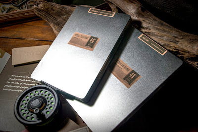
'Rooting my identity in my love for the outdoors and the geography along the north 46th parallel, I designed and constructed a unique item. The "fly box" was inspired through both my love of fly fishing and the high level of respect the sport commands amongst outdoorsmen. It is an art that takes discipline and uses beautiful lures designed specifically to attract the intended quarry - much like graphic design.  

Each fly box is constructed with the recipient's location in mind - the two flies included are effective lures for trout in the intended area. Each fly box also lists a nearby stream in which the recipient would find use for these flies. My business card is included along with an informational brochure - complete with a short biography and personal snapshot of my qualifications. '

This is the self branding and promotion for designer Matt Ludvigson:
SWOT ANALYSIS: 

STRENGTHS:
The presentation, attention to detail and the overall display quality makes this promotional pack as success.  In terms of strengths its executed really well and is consistent within the design.  The theme definitely says something about the designer, in this case his love for the outdoors, geography and fishing.  He uses a variety of stocks and embosses the business card.  This promotion pack and self branding reflects the work the designer does as most of it is based on the time he spends outdoors.

WEAKNESSES:
It definitely communicates one specific style of design, overall the presentation and design is visually appealing to anyone but more so if you are interested in an 'outdoor/nature/geography' aspect of design.

OPPORTUNITIES:
The designer has only used this promo pack one time, at a AIGA portfolio review event, where they received good feedback and kept by the reviewers.  However, if the designer needed to use them again I feel this would bring work and attention as its something that is memorable.

THREATS:
Costly to produce several times, could appeal to a certain type of client.


SAMPLE THREE:  BENJAMIN DOOLING
I am committed to quality both professionally and personally.  As a conceptual thinker and award-winning package designer, I possess high work ethics, adaptability, and the belief that outstanding creativity can be achieved through effective planning and strategy.

This is the self branding for designer Benjamin Dooling: Designed and screen printed on 16oz Kraft Paper Stand-up Pouches and 5lb Gusseted Bags filled with locally roasted coffee, with a message aimed at specific target audiences emphasising on the skill set of typography, packaging and hands on creativity.
SWOT ANALYSIS: 

STRENGTHS:
Creative idea, especially as this designer focuses heavily on package design and this sends out a clear message about the quality of his packaging design and allows the audience to see his skills visually as well as in a CV type format.  The information is delivered cleverly through word play, for example 'date roasted' is the term used for when this piece of self promotion was created.  Authentic, good quality packaging design.

WEAKNESSES:
I assume the link of advertising his graphic design skills on a coffee package is to do with the fact he has a strong passion and success in packaging design.  The idea in general is clever and creative but is there a specific reason why its coffee packaging? Does that say enough about him as a personal designer?

OPPORTUNITIES:
Interesting idea, something that you could remember.  Its interactive which is always something good for this type of design, Inside the bag contains a small card reading "lets talk over a cup of coffee".

THREATS:
High postal cost? and not personal enough to the designers self branding.

SAMPLE FOUR:  STUDIO WORLDWIDE

Studio Worldwide is a multi-disciplinary design practice specialising in crafted and considered graphic design and art direction.

Established by Dutch designer Thijs van Beijsterveldt and British designer Joel Priestland, Studio Worldwide's foundations are based on a combination of international backgrounds with extensive design experience to produce unique, effective and engaging creative.

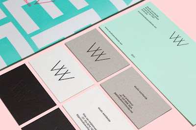
This is the WW identity and promotion they have designed including a poster, business cards and compliments slip:
SWOT ANALYSIS: 

STRENGTHS:
This is the self branding for design company WW.  They have used a range of stocks that all run consistently  throughout the branding's colours, which works nicely as a set.  All the business cards and letter heads have the contact information and website to enable viewers to log on and see the work.  The poster is the best form of promotion in this self branding pack, raising awareness of the company and getting the branding and information out there.

WEAKNESSES:
They have done nothing out of the ordinary to promote themselves, the general business cards, compliments slip and poster, unless you were in close contact with the design agency I struggle to see how people would come across and interact with the branding unless the poster was placed in popular creative environments.

OPPORTUNITIES:
The standard promotional pack for a design agency, business cards can be circulated and people can recognise the brand throughout the consistency of the design.

THREATS:
No real methods of distribution , how would audience see it?

SAMPLE FIVE:  RADFORD WALLIS 
We are a visual communications agency, committed to creating distinctive, quirky and intelligent (sometimes all three!) ideas that engage a specific audience, communicate effectively and make the whole experience memorable. 
Ideas that stand out.


RADFORD WALLIS ON SELF PROMOTION:
Self promotional jobs are often amongst the trickiest. Having to come up with a brand new approach when your message is so familiar can be difficult. However we believe that we have created playful and engaging “cards” for our clients and friends.
EXPLANATION OF WORK:
Some examples are shown here: typography found in packing tape on boxes was used as change of address card; a festive story embossed into turkey foil and a poster of charade games, broken down frame by frame, were both used as Christmas cards. All these ideas reflect our approach and hopefully raise a smile.
SWOT ANALYSIS: 

STRENGTHS:
I think this is one of the strongest types of work promotion I've found so far, the idea to promote your work through products such as christmas cards and a festive embossed poster sent to people from the design company will surely raise design status and promote their work in a way thats fitting, current and exciting.  The use of interesting a different materials (tin foil embossed festive poster) is something memorable and eye catching.  Images of the designers on the christmas cards is always good for self promotion.  Playful and engaging.

WEAKNESSES:
This current work is only relevant seasonally (Christmas) so other ideas and designs would need to be created to ensure this kind of work promotion all year round.

OPPORTUNITIES:
Work and self promotion advertised in a way that is engaging and has a purpose, audience are more likely to keep these designs as they are more than just the design agency advertising and promoting themselves.

THREATS:
Audience specific, how could they distribute these christmas cards to existing clients and people they already interact with?


SAMPLE SIX:  EFFEKTIVE

We designed these two colour litho self promotional mailer/resumés for approaching Sydney based agencies at the end of 2008. The idea was to create a promotional piece which would have impact and showcase work examples and information as well as become a physical example of work in itself. The response to these was excellent and resulted in a variety of interviews at some of Sydney's top agencies.

SWOT ANALYSIS: 

STRENGTHS:
This is a very clean and well thought out lay out.  I feel the format is successful as it folds up nicely and is easy to send and distribute at a low cost.  It has vital information displayed as text and as you read more and open up the folds a poster of nicely presented work from the design studio is displayed.  This is easy for the audience to respond to and works not only as a self promotional tool but as a piece of work in itself.

WEAKNESSES:
In terms of format this works really well, allowing clients to see a variety of work, however certain parts focus heavily on type, clients could be put off by the amount of text shown to them for something thats meant to be effective straight away.

OPPORTUNITIES:
This is allowing many opportunities to showcase their work as a design studio and because of format cost wont come into the mailing of the work.  This got the design company received the opportunity to have interviews at some of the top design agencies based in Sydney.

THREATS:
Quite disposable

SAMPLE SEVEN: SWINK

Swink “Let’s Tell Better Stories” Direct Mail

There's nothing like a good campfire to get people talking. We put together a direct mail piece to invite people to reconsider the way they've been marketing themselves and to believe in the power of a good story — their story.  


This is a direct mail piece put together by Swink to encourage people to look at how they have been marketed and whether it tells a story about them? Advertising their company as an option for personal branding.
SWOT ANALYSIS: 

STRENGTHS:
The distribution of this piece is strong, a direct mailer which will reach its target audience.  Letter press, high quality stock.  Its main strength is that its interactive, something the audience can engage with and construct the pieces to form a 'campfire' scene.  Its also something they are likely to keep as its well executed.  The concept works well, asking the audience what their story is and linking it to a 'campfire' theme as this is usually associated with telling stories.

WEAKNESSES:
One use, once assembled not much use for it.

OPPORTUNITIES:
Opportunities for new clients and more work, something memorable.

THREATS:
Costly letterpress technique

SAMPLE EIGHT: POPCORN DESIGN
POPCORN DESIGN: Popcorn is a creatively-lead graphic design studio based in East London. We help our clients increase awareness of their brand through cross-platform media. We are a complete creative resource, using a trusted network of experts and suppliers. Collaboration means we can fulfill any or all parts of your brief. Regardless of scale or budget. From branding and design to websites and digital media – we get the job done.

Studio mailer sent to our beloved clients for valentines day. Hand silk-screened in 1 colour on 270gsm Context Ivory by Loligo. A limited run of 100 were printed, hand-numbered and embossed.
SWOT ANALYSIS: 

STRENGTHS:
The main strength of this work is the thought behind it, this is a great way of showing existing clients the design company appreciates their custom.  Its something personal and the client will take that into consideration.  Good use of processes and quality finishes.  Only 100 made which makes it unique to the clients.

WEAKNESSES:
Only select amount of people will actually get to see and receive this work.

OPPORTUNITIES:
This is a great way of keeping their existing clients interested and a way of letting the clients know they are thinking about them, this way, the design agency stays in the minds of the clients hopefully leading to more jobs and other opportunities.  Depending on where displayed by the clients can attract new clients.

THREATS:
Costly technique - hand silk screen and embossed.  High postal cost?

SAMPLE NINE: ONLINE PORTFOLIOS
Cargo Collective, Behance, Tumblr etc.
This is something that has become increasingly popular recently within graphic design and is a different way to print based distribution.
SWOT ANALYSIS: 

STRENGTHS:
Easy access for everyone to see your work, gives you online presence and allows you to get feedback and comments from other viewers and designers.  Easy to keep posting updates and progression in work.  Very easy for everyone to look at, minimum effort required to showcase your work.

WEAKNESSES:
Online could take away from the quality of the printed final work, limitations with how much the viewer can actually see, unable to interact with the work, pick it up, feel it etc. which is an important factor within print and various other processes (embossing, foiling etc.)  Amongst thousands of other designs, hard to make your specific design really stand out.

OPPORTUNITIES:
Accessible to everyone, online presence! Anyone can come across your work and you can then be given opputunities to collaborate or 

THREATS:
Costly technique - hand silk screen and embossed.  High postal cost?

SAMPLE TEN: GENERATION PRESS
GP  is  10-Brochure - A  dual-purpose, limited-edition  brochure  for  printers .  Generation  Press,  both  to  celebrate  their  10th  anniversary  and  also for  the m  to  showcase  their  print  prowess  and  techniques  to  new  and  existing  clients.   We  also  enlisted  the  talent s  of  photographer  Timothy Saccenti,  illustrator  Sanna  Annuka  and  copywriter  John  O’Reilly  and  added  our  own  contributions,  to  make  this  a  piece  that  would  be  coveted  and  kept  for  years  to  come.  The  piece  was  selected  for  D&AD ‘in-book’  2010.
Client-  Generation  Press.   Year-  2 009


This  is   the work  from  generation  press  to  s howcase  their  skills  to  existing  and  new  customers.
SWOT ANALYSIS: 

STRENGTHS:
A really high quality piece of design to receive as a mailer, something that allows customers, existing and new, to show of their skills within print, a range of stocks and processes compliment the design and allow the audience to see the range of possibilities with Generation Press. A good way of keeping existing customers in the loop and definitely opportunities for new clients with this sample of work.

WEAKNESSES:
Limited amount of people will see the mailer as it will be sent to specific clients and possible new ones.  Needs to be a way that they can get this distributed to more people without the cost effecting it.

OPPORTUNITIES:
A few opportunities can come from this mailer, its a piece of work that showcases Generation Press' best assets and is a nice piece of design work in itself that will be kept by many of the receivers.  This gives existing customers a reminder of the services offered and attracts new clients.  It also was selected for D&AD's  'in-book' 2010 which raises publicity.

THREATS:
Costly to produce and send out to a lot of people