Thursday 24 April 2014

SELF BRANDING//DEVELOPING DESIGNS//OUGD602

self branding:
This ties into one brief that I've been working on for extended practice which will go nicely with my self branding.

manifesto development:
I wanted to call my manifesto 'A practice for everyday life' as I thought this was quite a nice title, however a design studio in London are already called that so I need to think about changing the title of the manifesto.  I have referenced William Morris in my manifesto as I took his views and morals from researching into him on my COP module.  News from nowhere is a sub heading for my manifesto which is taken from a title of collected writings by William Morris.  My logo will also feature on my manifesto as part of my self branding.  The typeface used throughout is Minion pro, which is the text most of my branding is, although for the body copy of the manifesto I have chosen letter gothic stnd, which I think compliments each other as they are both quite different.
original layout:
My initial thoughts were to have the manifesto written as a list, my point as the heading, supported by a quote that displayed the above point.
I ended up changing the layout to suit my personal branding a little better.  My ten points are made up of either people I admire or the quote being very fitting to the point I was making in the manifesto.  I have also decided to call the manifesto 'this time tomorrow' which is one of my favourite songs by the Kinks and also quite appropriate for a manifesto title.
final layouts:
This is how the final A4 manifesto will look, featuring the ten points and quotes, these quotes include: John Lennon, William Morris, Monet, Van Gogh, Albert Einstein etc.  The title of the manifesto includes a reference from Morris (News from nowhere) and a Kinks song for the title, 'this time tomorrow'

As well as my branding logo I wanted to include my name and title which is part of my branding, written in the same typeface.  These were the two layouts, with my name centrally aligned and aligned to the left.  At first I preferred the left aligned, however after getting some feedback and looking at it in terms of heir-achy, I think it was important to have my name and title aligned centrally as its quite an important part.
calendar development:
Along with the manifesto and the other products for my self branding I wanted to create a personal calendar that actually ties in with the manifesto.  My manifesto was a ten point manifesto, I will apply these morals and quotes to each month of the year and then add two extra quotes for the two remaining months.
final calendar: I don't know whether to print on white/cream stock or to see whether brown parchment would work well for this, I think its worth testing on both because I think the brown could work surprisingly well.


SELF BRANDING//DEVELOPING DESIGNS//OUGD602

self branding list:
I have made a list of items that I hope to create as part of my self branding.  I have already created my logo which I'm quite happy with, I think it reflects me as a designer and is a huge improvement from last years self branding.


logo
postcards
business cards
-
calendar
manifesto
-
creative cv
website

logo:


business card development: I have to consider that the final outcome of this branding may possibly look different when printed as I feel a lot of it relies on the stock choice, and from the early stages of designing I decided I wanted to print on brown stock with textured creams as I think these would compliment each other.

I want the business card to be a simple design which will be printed on two different coloured stocks (the brown and cream) at the moment Im unsure whether to include the logo as I think the name in Minion Pro allows the branding to be consistent without it and as its such a small ares to work with on the business card I don't want it to look over crowded.
I don't know whether I like the black highlighted details, I think it would look quite nice on white/cream stock but less so on the brown as it would then be a combination of black, white and brown ink and stock, which I think could start to look a little busy and not very complimentary.
This is what the business card would look like if the logo was placed on the front.  I don't think it looks as bad as I first thought, I thought with all the information on the front, having the logo would make te design too busy, but I think I can get away with it.
Alternatively I could have the logo on the back of the card, keeping the front of the business card purely for contact details.  This is something I will think about before printing, and also what stocks would work best for the business card, I feel white/cream may be more suitable for business cards.
letter head:
Again, to keep the branding consistent I wanted the letter head to be clean and simple, this is something that will be printed on white/cream stock as opposed to brown and obviously because its a means of contacting people it needs to look professional and stylish.  In the letter head I decided to include the 'news from nowhere' (William Morris) and a quote taken from my manifesto which I thought looked quite good in the left hand side of the wide margin.  I have also included the header and the logo, however this was hard to decided with the positioning.
 Placing the logo on the letter head was quite hard because I couldn't work out if it should be in the margin or in the corner of the page.  I cant decided at the moment because I think they all look slightly out of place.  At the same time I think all of them could work apart from the fourth one, I think thats too busy with the text in the margin.
stickers & postcard
I wanted to create some extra prints for the branding and for the postcards thought about using photography I had taken overlaying that with Minion Pro.  I think this could add some colour and visual to the branding, and also show the kind of photography I have done.  i wanted to design some stickers that could be applied across some books for stationary branding, these will be simple and have similar designs to the business cards etc.

I also looked at manipulating the logo a bit as I quite liked the effect I got when using the scanner.  I think this could work quite well for certain things within the branding as long as it was kept consistent and the main logo was still consistent throughout all the other designs.
postcards: As well as the photography postcards I also wanted to have one with a little passage about me as a designer, or what I consider to be an accurate description of me as a designer.  Postcards will be printed on white stock as opposed to brown, I think this would suit the style more so.  On the right is my with compliments slip which is similar in terms of layout to my letter head.

Tuesday 8 April 2014

PPP//STUDIO VISIT: DITTO PRESS//OUGD602

ditto press studio visit
Today I visited ditto press which I found to be quite a motivating trip.  Unfortunately Ben wasn't in which was a shame as I hoped to talk to him a bit more after meeting him when he came in for the talk/briefing.  However I got a chance to speak to some other members of the team just generally about Ditto and about the possibility of printing off some zines for my contemporary culture brief.  I was briefly explained about the risograph printing and the options open to me when printing my zines off.

We also spoke a bit more about the type of work Ditto do and the clients they are involved with.  When Ben first came to the college I liked the look of the work he had shown us so I was quite excited to see the other things they had worked on.  After having a chat about the printing options and being shown the type of printing that would work with one colour/four colours etc.  I was then given the opportunity to look at dittos collection of publications.  Before this visit I hadn't been massively interested in riso printing but after looking at some of the work they'd produced this is definitely a printing method I want to try in the future.  The more work I saw by ditto the more interested I became in their practice and the studio.  They mostly focused on publication design which has been an increased interest of mine throughout the course, but the thing that interested me the most about the ditto publications were the visuals used.  A fair bit of photography accompanied by text, and also the printing methods were intriguing to me.

I spoke briefly to Sophie about how she ended up working at Ditto and what she has studied.  She has actually got a degree in illustration from Camberwell, where I did my foundation.  She said she was interested in riso printing when she was at camberwell and thats what attracted her to Ditto.

Looking at the work and asking questions about specific projects has given me new ideas and inspiration for certain projects that I have been stuck on.  Below are some designs by ditto that have allowed me to think about briefs that I am doing in different ways, which is refreshing as I had become frustrated with how slowly it was taking me to think of some ideas to move forward.
The studio space was quite intimate and whilst I visited there were four of them working, the room was mostly full of printed matter and books, with printers and laptops.  Visually everything was quite interesting for me as the work they do is the kind of thing I would like to be involved in after college.

These are some of the publications I particularly liked and some inspired new ideas for current briefs I am working on.  This is the style of printing they offer, which I hadn't really thought about for the contemporary culture zines.  I think this could be a possibility, it would definitely change the overall aesthetic of the zines so I'll have to think about which would suit the content more.
Looking at this particular page makes me want to print them in this style as I think it would compliment the style of photos i've received so far.  I also like the layout of this zine, as I am looking at potential layout ideas which is something I will be working on when returning from the easter break.
I think something that I realised whilst looking at some of the designs ditto had made was how the final result could be effected by the printing.  Sometimes when working on designs I feel they look to simple and almost boring when designing them on inDesign, however it can make all the difference when printed in a certain way and also hard copies can look completely different as I feel on screen sometimes if the design has a lot of white space it can look too clinical and as though not much design has gone into it.

I particularly like the photography in this publication, and the printing, which I thought might not work as well with photographs, just added to the overall aesthetic of it.  Another thing that I noticed at Ditto was the variation of format sizes.  I've noticed I tend to stick to a similar format size when creating publications but I would like to explore bigger format sizes in the future, A4 or bigger could be a potential format size for the ditto brief set by Ben.
Again, I would never think to design just focusing on type like this but I think it looks good, its all about the type choice and layout.  I should think about this more for the unsung heroes brief as I was having trouble thinking about the imagery I could use for that.  I didn't want to use photographs for it as I had already looked at that type of visual for the promotional material side of the brief.
I liked this publication, it was printed on a smooth stock that allowed the photographs to be printed really clear and crisp and focused on someone taking photographs of people taking photographs.  I thought the photography was strong and interesting so visually it was intriguing.
I really liked this particular publication, the contrast of type with hand writing is something that I would like to do with my ditto publication.  As I am looking at recording conversations and gathering an archive of conversations and communication I would quite like to display it with the contrast of type and hand writing.  Since starting third year I have become increasingly interested in incorporating my handwriting into my designs.  At first I came across some problems and when live tracing my hand writing and zooming in it looked to vectorised and I wasn't happy with the final results.  However as the year has gone on i've become a bit more experienced on how to get the effect I want, and sometimes just scanning it in and cutting out the stock background works better.  This is something I will explore in three briefs that I am currently working on: unsung heroes, ditto's brief and the museum of childhood publication.
More examples of hand writing in publications, this one I particularly like as it just looks quite natural, I actually really liked the layout of this publication.   It was quite large in format and was a zine with film photography of Adele the singer, the photos were quite natural and depicted her in private surroundings, her being the main focus.  There were also scanned objects from gigs of hers such as tickets, wrist bands etc.  Her handwriting accompanied the scanned objects which I thought was a nice touch and made it seem slightly more personal.  This is something I considered when collecting the childhood memories but I gathered some though email and so the design would be inconsistent.
I photographed this one particularly for an example of self branding.  Whilst designing my logo and thinking about the branding I was considering stock and colours which could make a huge difference.  This is the kind of coloured card I want to use when designing my self branding.  The logo with be black ink and the colour will come from the stock rather than the design itself.  I think the black on the brown card works really well and this is similar to what I want.
This is quite a simple design but I need to be thinking about ways that I can display my written passages of unsung heroes and avoid using images.  A new idea is to scan in different stocks, a variety of colours and textures and either hand write or type the passages on top, simple but I feel the content of the book should be almost strong enough to not rely heavily on a huge visual impact.
If sketches were appropriate or fit with the passage I would like to include some scanned sketches as I think this would work well with the type.  It wouldn't be a huge feature within the publication but could be a nice feature, or possibly the name of the unsung hero/heroine hand written and scanned in.

Monday 7 April 2014

FINAL EVALUATION//BRIEF 14:DIALOGUE//OUGD602

final evaluation // brief 14: dialogue
This was a quick response for a brief written by Eve and Nathan to be involved with the dialogue exhibition which took place at the corn exchange.  Even though ultimately I didn't use the primary research I collected I still enjoyed the process of collecting it and I will use these techniques and extend the certain area I was researching for a different brief.  Originally my idea was to collect conversations and use this information to form a dialogue themed poster of random snippets of conversation.  However, the idea never developed far enough as I came up with a new design that I thought fit more appropriately for the exhibition.  I thought this brief was good in terms of having to work to certain requirements, because we have had the freedom to write our own briefs this year, most of the outcomes have been suited to the criteria I wanted.  This brief allowed you to work to A3 scale, black and white and either vector or half toned images.  Shockingly enough this was the first time I had learnt how to and used the half tone effect.  I feel myself becoming slightly more confident on photoshop, which is really encouraging because a couple of months ago I wouldn't of even edited photos on there.  Im learning, even though I am far more confident on illustrator, that some things are so much easier and effective when using photoshop.  The design itself I was pleased with in the end as I thought it depicted the theme of 'dialogue' quite well.  The photograph that I had taken fit perfectly for the quote that I found which really highlighted conversation/dialogue, from the catcher in the rye.  I also made a colour copy which I think I would prefer in my portfolio, as the original design had to meet the requirements of the brief set.

colour copy:
black and white copy:
dialogue:
I was really impressed with the exhibition Eve and Nathan curated, I think it was a huge success and you could see how much work had gone into it.  It was rewarding to see my design in an exhibition and to be part of that, it was also interesting to see how the blind collaboration turned out and how my design looked when screen printed and manipulated/edited.

my design in collaboration:

Sunday 6 April 2014

FINAL EVALUATION//BRIEF 09: INTERRAIL//OUGD602

brief 09: interrail // final evaluation:
This was quite a quick brief in terms of the final outcomes but I enjoyed using my own photography, which was probably the first time in third year that Id started using my own personal photography for work and since then I have much preferred this way of working.  The designs are quite simple, but after Interrailing myself and coming across their promotional material etc.  I wanted to try and design something that looked a little more appealing for its target audience.  I was directing the promotional material at students/people in their twenties as I feel this is usually the age group interrail mostly attracts.  In terms of the digital design I am pleased with, however, after finishing other briefs further on into the year i have decided I will need to reprint these images.  Learning from experience, the paper from the library will not allow the colour vibrancy to show as much, however matt paper from the digital print room will allow the colours to be displayed a lot more, I think this will definitely improve the final outcome of the printed versions.  When I have reprinted them I also need to think about a way I can photograph them to look as professional as possible.

Saturday 5 April 2014

SELF BRANDING//DEVELOPING DESIGNS//OUGD602

self branding: design development // second attempt
After making some first attempts to put together a logo I decided to scrap most of them and start again using the same typeface but changing the direction slightly.  This is my full name written out in Minion pro with no editing done to it (no kerning etc.)  I don't particularly like the overall look of that, I think it seems quite boring and possibly corporate.
These are the new typefaces as part of my self branding design, this will be used over the products along with a smaller logo that can be stamped across a range.  At this moment I am quite undecided on whether I prefer regular or italicised or a combination of both.  I much prefer the typeface in all caps as opposed to lower case and with kerning.

The first design is my name simply written in Minion Pro.  The second the same just italicised which I think looks slightly better.  The last two are a combination of regular and italicised, the third italicising my middle and last name which I think could work as its drawing more attention to my first name.  The last italicises just my middle name which could look slightly obscure.
I then looked at how I could make the typeface a bit more personal and individual to my self branding and how I could slightly edit some letters.  The ones that seemed easiest and most suitable to edit were the B and the R.

original lettering:
edited lettering:
I thought this could work quite well at first, however it would be limiting the design as I was leaning slightly towards the italicised type and that would be a lot harder to edit.  Also when creating the outlines of the type it makes them slightly thicker, its not hugely noticeable but I prefer the typeface before.
logo development:
These were some ideas for the actual logo/stamp, I think at the moment its quite simple and plain but I feel it could work well if the rest of the branding was thought out and consistent.  I am leaning towards the design with the smaller 's' or the italicised KSB.
circle variations:
I thought this added a bit more of an identifiable symbol to the branding and I quite like the idea of the branding being black and white and having coloured stock to incorporate some colour. 
I like these designs less, when I think about these being printed I imagine them on brown stock/cream textured stock.  The only problem is I don't know if the white text would look good against the black logo on brown stock.  I could try having the initials the same colour as the stock as opposed to white.

square variations:
I didn't think originally I would like the square versions, however I think one or two of these could work as well as the circle designs.  The top two designs would have black outlines and the space within the square would be transparent, so whatever stock it was printed onto would effect the logo.  I think the black ink would like nice against the brown parchment stock I have in mind.
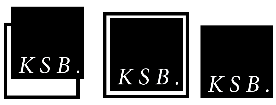
Other versions of the square symbol.  I think to test what would look best I'd have to experiment with printing and stock choices.  I think amongst the designs there is something I would be happy with but obviously at this stage its hard to be satisfied with it as it is at the early stages.
incorporating 'graphic design'
Looking at ways that graphic design can be placed in the branding.  I like graphic design being italicised but I think with the design it would be good to have a contrast of regular and italicised minion pro and I prefer my name italicised (second design)
Outlined box, keeps the logo all together - would work as a stamp.