self branding: initial ideas
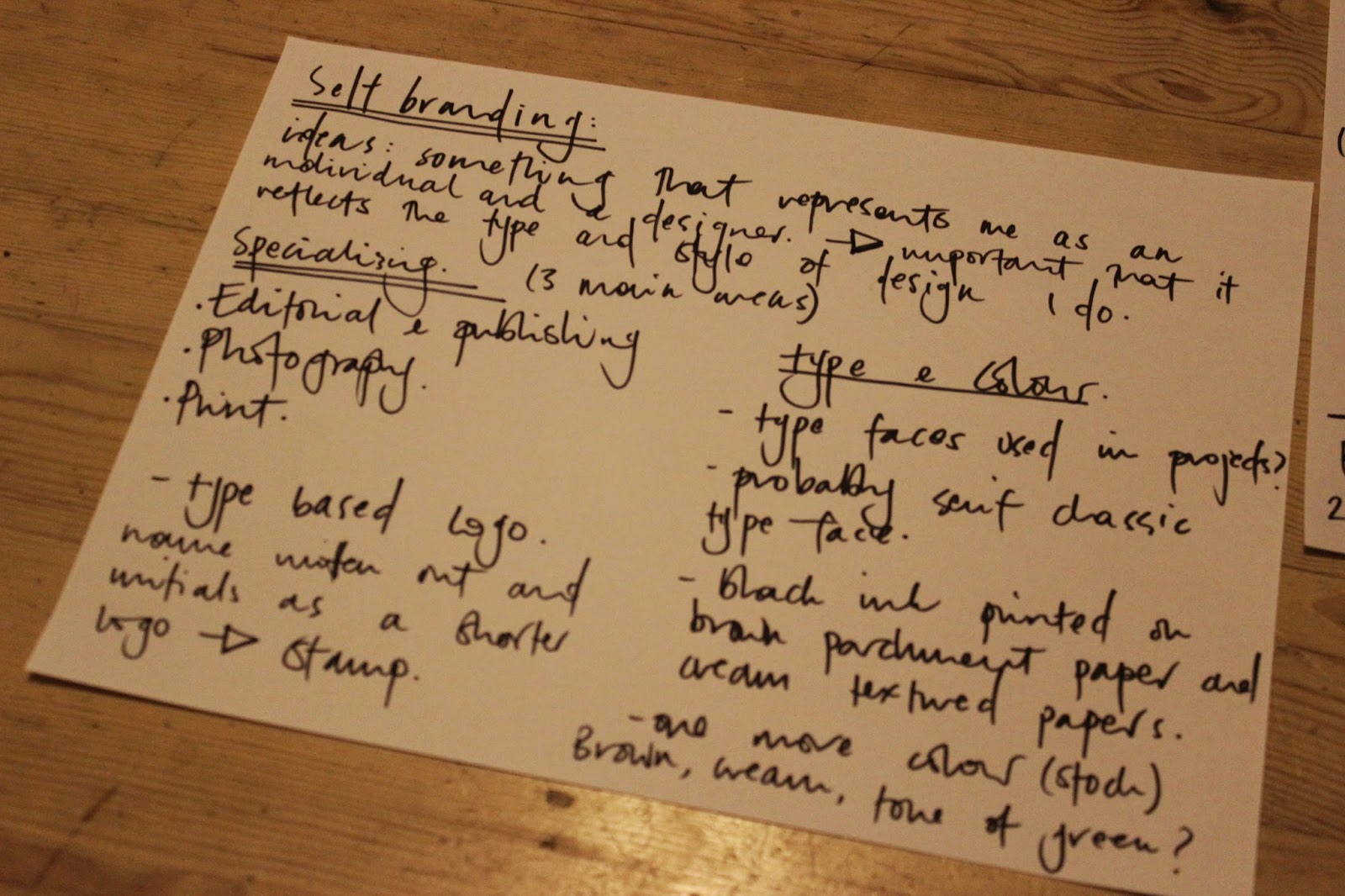
I started jotting down some ideas for the kind of style and design I wanted with my self branding. I found this quite difficult because trying to sum yourself up with a logo and a branded range to try and portray you as a designer and individual is a hard task. As I wasn't happy with my branding from last year I wanted to step away from that general feeling.
I have looked at various self branding examples and the ones that seem to catch my eye are simple, mostly type based and attention to detail in terms of what stock its printed on etc. Thats something I will consider when designing, I want to use a variation of stock colours, initially I thought about textured cream stock, brown parchment and one other colour.


For the smaller symbol initial ideas included just my initials either in a circle or square, something simple that could be stamped onto various stocks etc. Black ink would probably work best if I want to print on brown parchment stock. Think about one more stock colour to incorporate and where the word 'graphic design' or 'graphic designer' would fit in with the logo etc.
No comments:
Post a Comment