-advertisements
-smartphone software
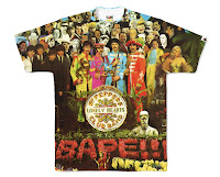
-branded clothing
-packaging
-websites
Stella Artois 4% campaign:
Design, layout and typography:
Mother London
Paintings by Robert McGinnis
http://bfourb.com/root/stella-artois-4-campaign/
Design, layout and typography:
Mother London
Paintings by Robert McGinnis
http://bfourb.com/root/stella-artois-4-campaign/
Smart phone software:iPhone 4
Branded clothing:
What is Graphic Design?
'Graphic design is the most universal of all the arts. It is all around us, explaining, decorating, identifying: imposing meaning on the world. It is in the streets, in everything we read, it is on our bodies. We engage with design on road signs, advertisments, magazines, cigarette packets, headache pills, the logo on our tee shirt, the washin label on our jacket. It acts on our emotions and helps to shape how we feel about the world around us.' -'What is Graphic Design?'- Quentin Newark.
The first set of posters are an advertisment campaign for a popular beer, Stella Artois. From first glance its not obvious that its advertising beer, the images are subtle and have a retro feel to it, 1960's and has a holiday theme running through the campaign, abroad. A very modern example of graphic design is the iPhone and Apple in general, it is designed very graphically, things such as apps and the general layout of Apple products rely on visual appeal as well as its obvious functions. The third design I chose to show in a different context to the others are on fabrics/clothing. Brands often use graphically designed logos and designs on tee shirts which will all have to of been done by a designer. My forth type of design is probably one of the most popular, packaging, which is everywhere. Recognisable brands design logos and packaging to associate themselves within the advertisement world. And lastly web design, which is a massive part of graphic design as we rely more and more on the internet and computers everyday.
Identify 5 examples of Graphic Design performing different functions:
-to instruct/guide
-to warn
-to entertain
-to promote
-to raise awareness
TFL: London underground tube map
Road signs
Theatre Poster: Birdsong 'Keep Calm...' Poster
NHS Drinking campaign posters
These five designs all have different functions, the first one is a map designed to instruct people on the London underground. A complex set of instructions, if your'e not familiar with the underground. A basic design of stops and the lines that each stops are on. This isn't a work of graphic design to visually please anyone, it is purely to instruct people. The next set of design is probably one of the most iconic works; basic road signs, these are also to instruct but abide by. Basic block colours with one word or just basic symbols, to the point and simple, to insure saftey. The third design is a poster promoting a west end show, this is promoting entertainment whereas the others were either informing, warning or persuading. An interesting image and the title of a famous book made into a show, already has a fan base so doesn't need to do much more than give the title. The forth poster is a spin on an original poster 'Keep calm and carry on', it has been made for comical effect, light hearted, and has no other purpose than to purely entertain. The final poster i chose that has a different function is a health warning. Created by the NHS to raise awareness to people about the harm and effects of drinking. This poster shows the most information and facts about its topic, with fitting images.
Identify 5 examples of Graphic Design delivering different types of messages:
-Warning
-Fictional
-Instructions
-Campaign
-Propaganda
-Warning
-Fictional
-Instructions
-Campaign
-Propaganda
'Fire kills, you can prevent it' warning poster
Fictional Graphic Novel illustrations
Instruction manuals
(left) UNISON campaign poster against slavery (right) Nazi propaganda poster
All these posters deliver a different message through graphic design. The first one is a very basic design with obvious imagery, its not for visual appeal, its trying to make a quick and informative point, a warning about an important topic. It uses limited colours for a standard design but I think this works well as its not distracting and allows the advert to address the point quickly and effectively. Essentially, it is a warning about fires in the home, the font used is big and bold, effective and eye catching. The second function of delivering a different message within design is illustrations within graphic novels, it doesn't highlight an important message compared to the first one, its a fictional message to compliment the story in the novel. The third design is an instruction manual from Ikea, which is quite recognisable around europe. This is sending out a set of instructions on how to communicate to someone a guide of what is appropriate actions to take in order to successful achieve whatever it is that comes with the instructions. The forth poster is a massive contrast to the fifth poster, the unison one uses basic graphic design of quite a symbolic image relating to the topic being addressed in the company colours. It is a campaigning poster engaging the audience in an important issue, the font sits at the top of the page simply stating the purpose of the poster. The final poster is a propaganda poster from the Nazi party encouraging anti semitic behaviour, using abusive and exaggerated images of Jewish people to persuade the general public to blame a race. All have worked in different ways and all send out a different message through the use of graphic design.
Identify 5 examples of Graphic Design produced using different media:
-Letterpress
-Photography
-Installation
-Web Design
-Motion Graphics
Letterpress:
Photography: Nick Knight
Installation: Saatchi Gallery (London)
Web Design:
Motion Graphics:
Blockhead- The music scene:
All five of these things are different examples of graphic design produced using different methods and techniques. The first thing i chose was Letterpress, photography which had become increasingly more popular as an art form in recent years. These are shots taken by Nick Knight. Installation (Saatchi Gallery) and web design both use differnet methods and lastly motion graphics which takes animation and video footage to create the illusion of motion.
Identify 5 examples of Graphic Design produced at different scales:
-window display
-book card design
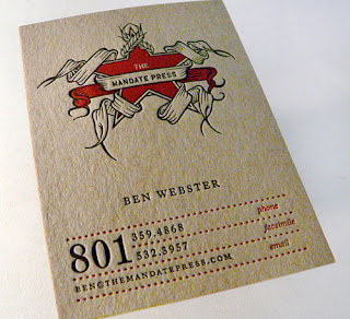
-business card design
-billboard advertisments
-stamp design
Window displays: Selfridges London
Book cover design:
Business card design:(small scale)
Billboard advertisement campaigns:
Stamp design:
All of these designs differ in terms of scale,some on a larger scale than others but all use graphic design to create these works. The first set of designs on a large scale is the window display in Selfridges, London. This is on a big 3D scale, an interesting design attracts costumers and lures them into the shop. This scale of design is a big contrast to book cover design. A cover of a book is quite important, it initially attracts the reader, or has a helping hand in drawing attention in alongside with the reputation of the book/author and the blurb. The book cover designs are interesting and eye catching, and fitting to the context of the book, which is the exact criteria needed for a successful design. Business cards are an example of graphic design on a very small scale. The design on a business card is very important as it gives a subtle impression about the person and their work. Some business cards will keep it simple with basic type and information, others however, will have a design or basic logo, probably depending on what profession the individual is in. Another large example of graphic design is billboard ads, these have to be eye catching and persuasive because ultimately it is advertising, most billboards are product based but the more interesting the design of the billboard is the more viewers it will attract. All three examples chosen I think work well and are definitely eye-catching because they are different and don't take the standard approach of 2D poster designed work. The last example is one of the smallest examples of graphic design I could think of. A selection of special edition stamps created by Royal Mail featuring famous quotes and characters from Shakespeare's plays. Although the design of stamps wont be taken into account as much as the design of a billboard they still need to be created and be functional to serve its purpose.


