I have started putting together a mock up for my personal website which I will hopefully be able to code in the next few weeks. I want the design to be simple with a lot of white space as I feel the main focus should be on the images of the work. I have decided to use the same typeface as my branding to keep it consistent and have incorporated my logo in a way that I think suits the layout of the mock up best. This was my original layout and design, however as I already have two variations of the logo, I didn't want to create a third as I feel this would start to look inconsistent.


This was my new idea for the homepage, to have the second variation of the logo as a constant feature on all the pages. For the home page I thought it would tie in nicely if I had the visuals from my manifesto (brief 07) as a set image that would change once the page was refreshed. The logo would over lay the images and the quote from the manifesto would be centrally aligned, with the tabs being positioned on the left hand side.


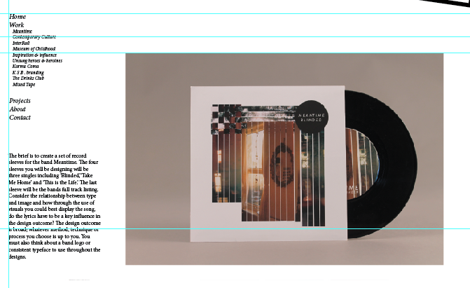
final web mock ups:


No comments:
Post a Comment