I wanted to look into some basic website design to get some ideas for my own. I think the simple ones work the best, and even though at this stage I am only mocking it up, I need to be realistic with what I could potentially build and so want to look at some basic designs to start.
This is the website of one of my favourite designers Caroline Aufort, I think the layout and design of the website is quite simple but works well and looks clean and stylish. All the work is clearly shown in a standard grid format making t=it easy to navigate.
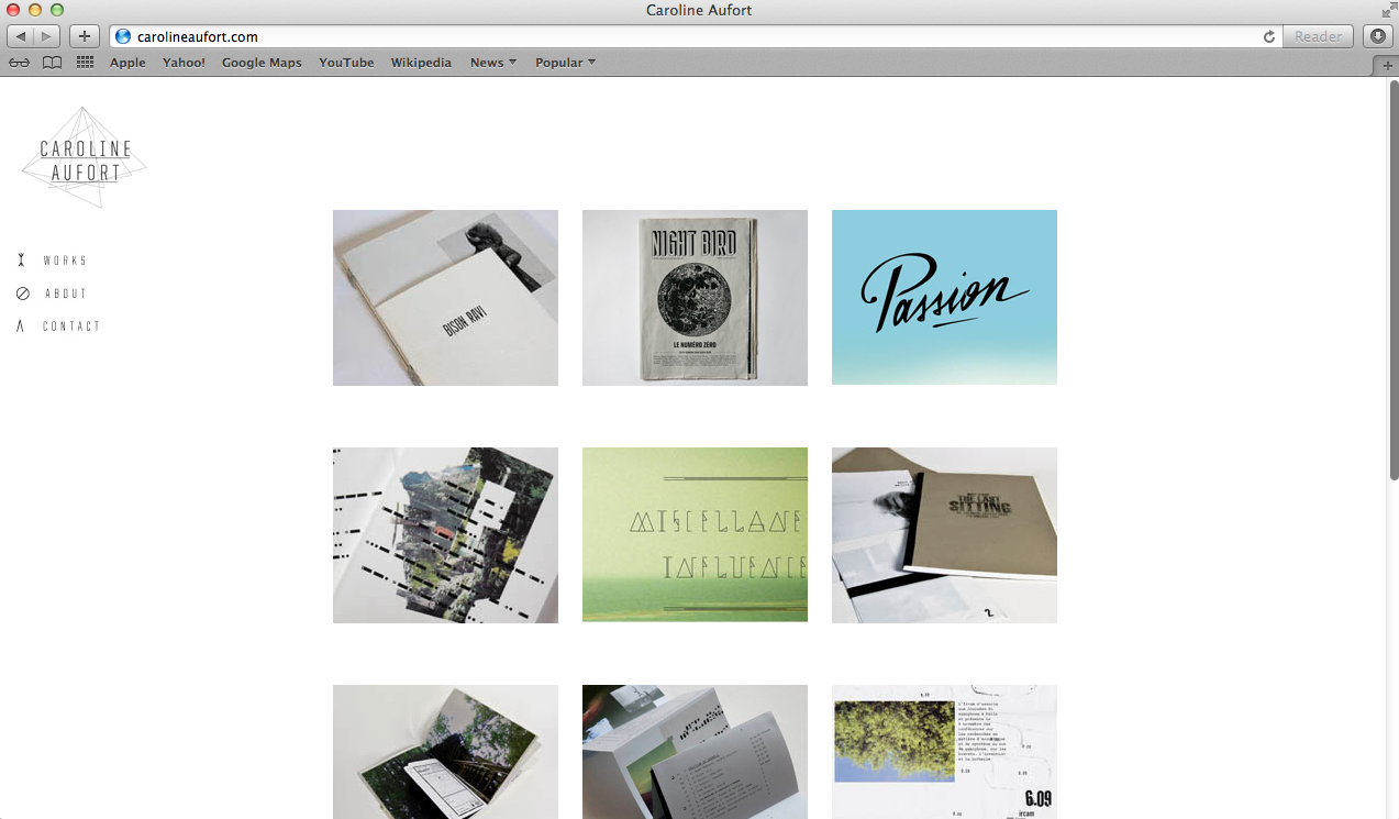
When clicking on a project it then takes you to a new page with a passage about the work and a basic scroll down which shows a selection of images of the project.


I think this is a nice design, I quite like the idea of having images of my work all in black and white on the homepage as I think this will make the design look more consistent. When clicking on the image of the work it would go back to its original colours. I think having the logo placed at the top of the page works well. I also like the idea of having one big image to focus on as soon as you click onto the homepage and then having other projects below with a smaller image:


No comments:
Post a Comment